Pasadena, California
The cannabis retail experience is rapidly evolving. As the industry matures, it is working to escape preconceptions of the typical cannabis collective. For example, many shops have the temporary look and feel of a re-purposed space put together by a group of friends (think former-yoga-studio-turned-pop-up-shop). Shops frequently have a rather disorganized and cluttered appearance, starved for space and held together with a make-do attitude. Poorly laid out counters, wire shelving and second hand cases are a look that we need to rise above.
The design opportunity is to raise the bar and present cannabis in all its new forms, to provide the clientele with an enjoyable and educational experience without overwhelming, and to accommodate state law unique to this retail environment.
I approach each dispensary project with the goal of communicating the client’s distinct identity through aesthetics. Consistent brand identity is expressed in the exterior and interior forms, finishes and signage. It is also important to include gestures to the location and neighborhood feel. These are all common design tactics, but not necessarily for dispensaries. Adapting design discipline to this new use and accommodating the industry-specific mix of security, product control and display is the new challenge.
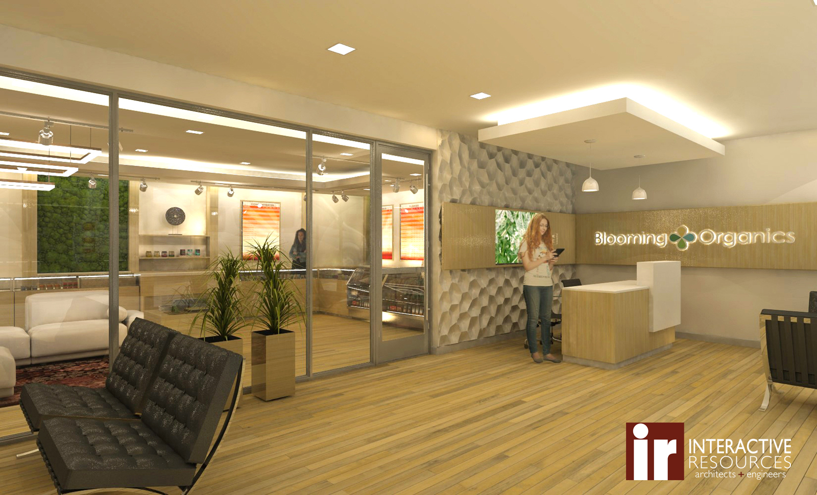
Consumer education in the dispensary setting is a prime example of this design challenge. Customers like to handle the product, look at the packaging closely, and want to have a friendly person explain and show the differences; retail design must balance how much each customer wants to explore by themselves versus being guided through the experience. With the Pasadena project, the floor displays are the primary and initial contact for general information about the range of products that are available. Displays are used to introduce new products such as varieties or brands of vape cartridges or edibles. It’s both fun and important to have attractive and educational displays about differentiating flower types or THC and CBD levels, but we limit this to one or two displays on the retail floor and video in the lobby.
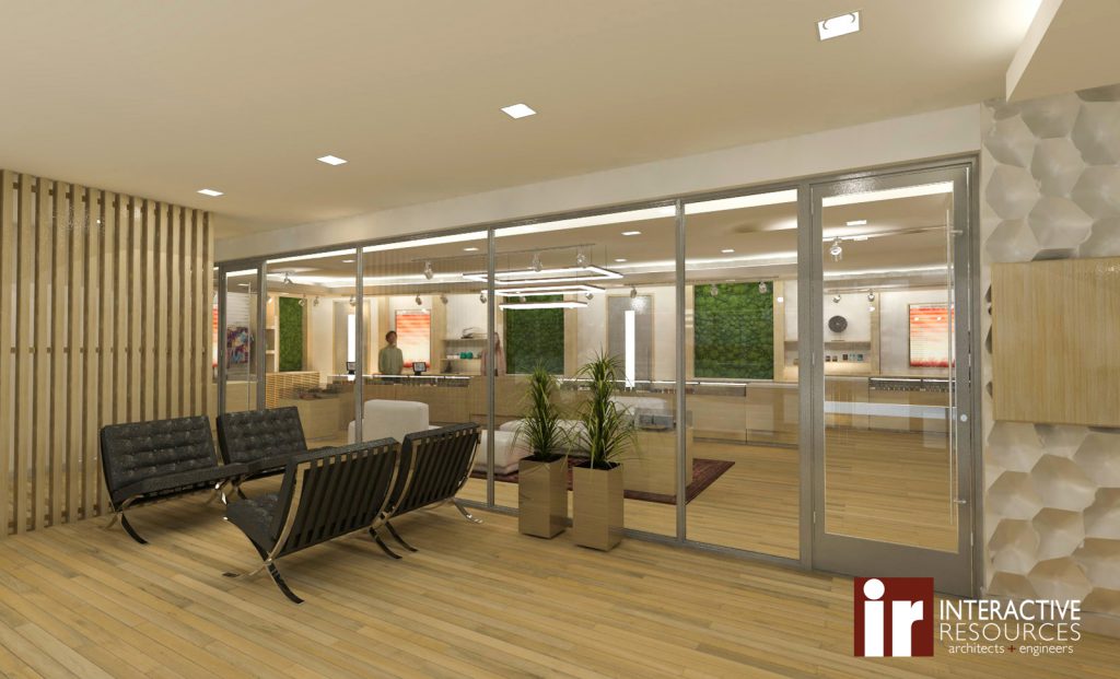
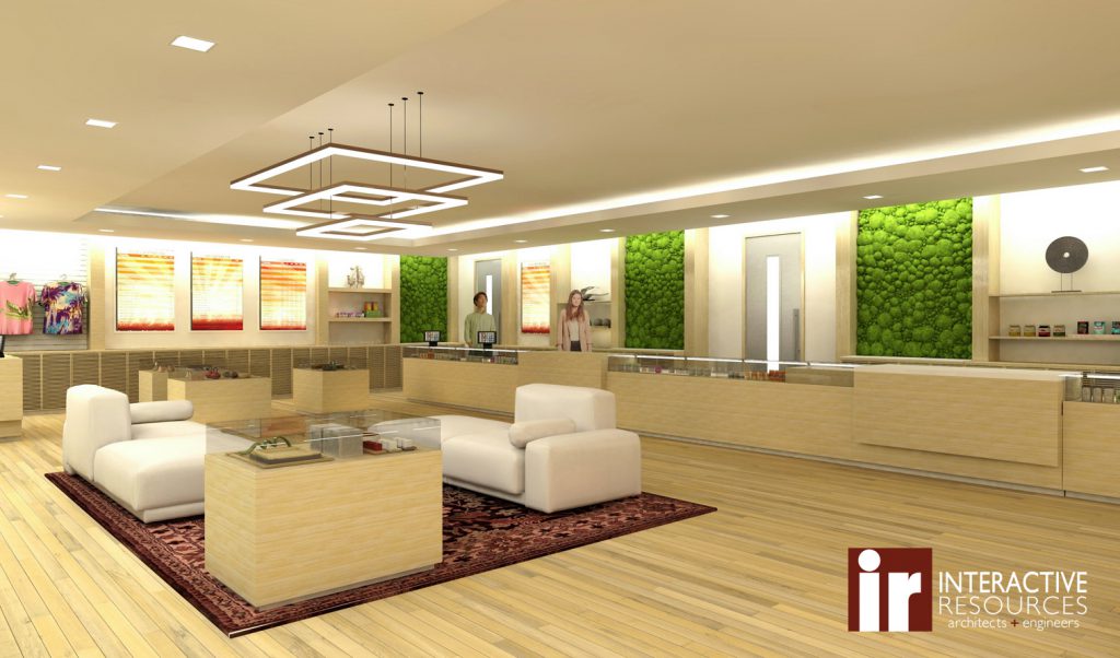
Currently, many dispensaries are on a spectrum from a small grocery store with lots of stock on its shelves (generous displays with the feeling of plenty to achieve the Gruen effect is a traditional tactic in the design of retail), to a stark boutique where only a single item is shown for each product, with stock hidden away. But, in most jurisdictions, allowing customers to simply fill a hand basket with product is not feasible. The product has a value to size ratio that is more like a jewelry store. The typical solution is to have everything behind a counter with staff, but this often results in a packed wall of product that is difficult to discern. Our Pasadena client wanted a more boutique-style shop with a clean and sparse retail floor. To accomplish this aesthetic, we developed a light and clean material palette, balanced with natural elements and materials.
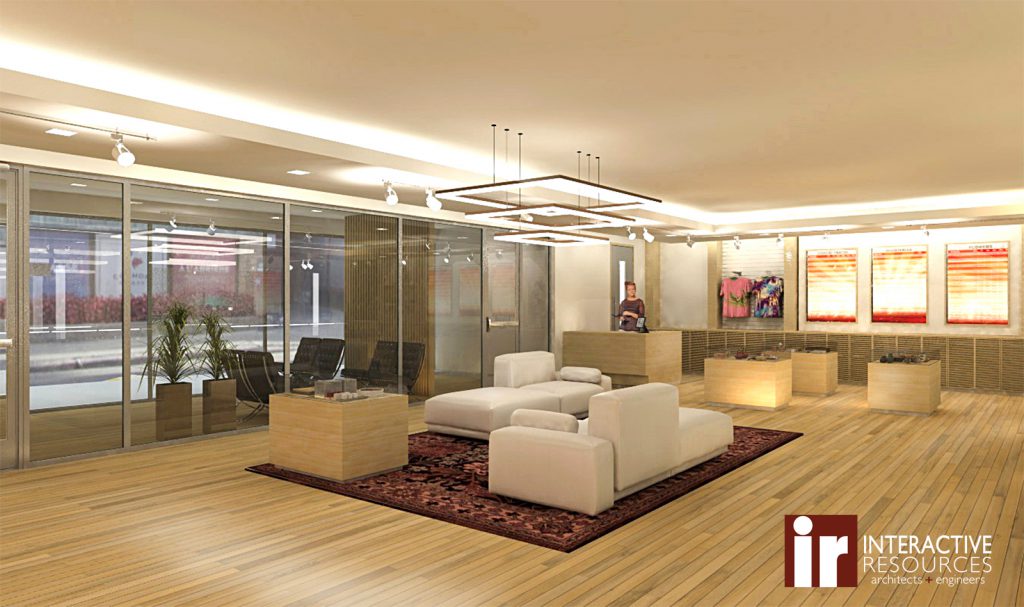
Our design is reminiscent of a boutique, which is also popular with Apple stores. There’s a significant amount of design and infrastructure to support how Apple interacts with customers and the ‘back-of-house’ and transaction operations to enable this, but we’re not going that far in the initial design. Unlike the Apple product line, the sheer variety of cannabis product has an aspect of plenty all of its own, and this is growing, fast. So, with this approach, we aim to make the experience easy and enjoyable.
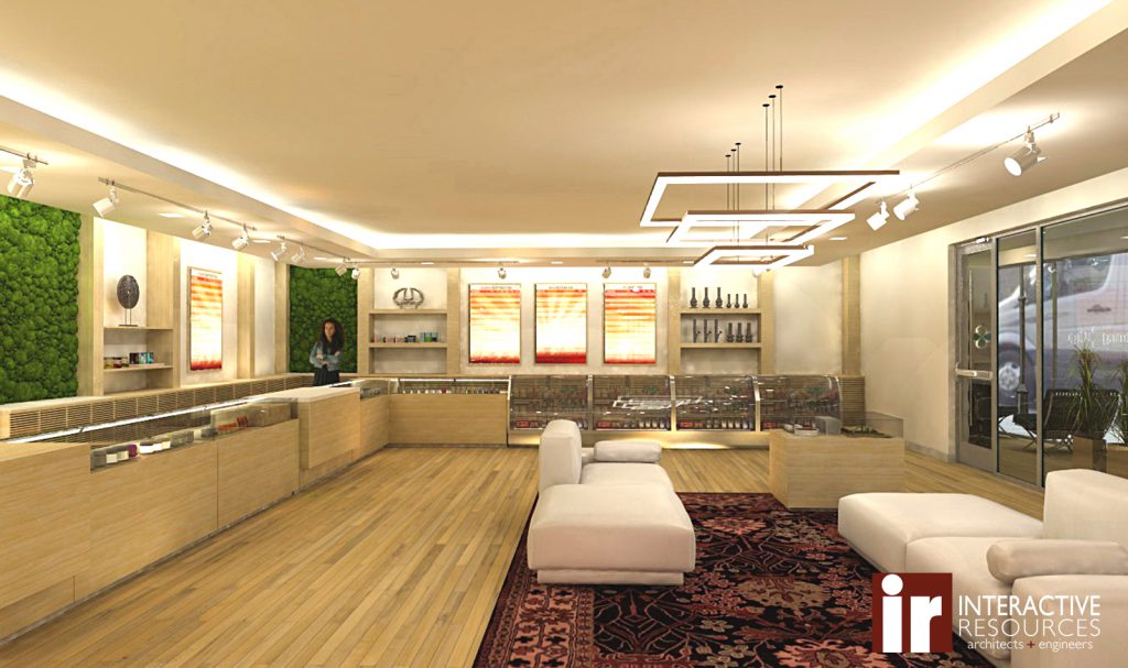
The Pasadena project also shows how different retail styles of each client dispensary influence the interior design. Without revealing operational aspects, I’ll say that each dispensary brings functional differences that are very clearly expressed in the layout, display methodology, customer flow, interaction placement, sequence and communication strategies.
While some dispensaries provide bar stools or seating at the sales counter, I chose not to use seating because the interactions generally are brief and do not require it. I think seating for an extended interaction is better accommodated by what I provide at the middle of the retail floor, which more closely resembles a social furniture layout. This brings warmth to the environment that is both welcoming and useful. I also integrate green wall panels and an abundance of reflected full spectrum lighting. I’ve seen some beautiful green walls, some real, some not. Which type is chosen will depend on how much maintenance will be in the budget. We’re looking forward to showing you the finished space in a future post.
– Brant Fetter, AIA
