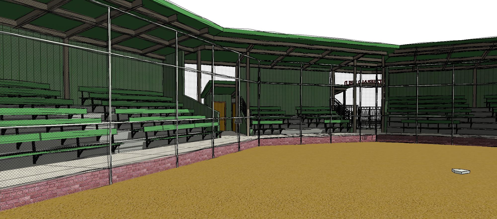
Our firm has the pleasure of working on a wide range of project types: schools, pharmaceutical, industrial, judge’s chambers, forensic work, historic preservation, major solar engineering, commercial, and large mixed-use. So it wasn’t out of our ballpark to be awarded the project of reworking Fitzgerald Field stadium in Benicia, California.

The project has gone through several versions to accommodate budgetary restraints. As often happens with public projects, when the community saw what would fit in the budget, there was a significant outcry for a return to a larger and nicer looking style.
The client described for us the general desired look and feel: “Panel sided, with red brick, everything else painted dark green with accents in black to go along with the steel structure…” and as he went on, I realized I had heard this before. A recent podcast by Roman Mars with 99% Invisible “In the Same Ballpark” described a very similar aesthetic based on the success of Camden Yards, and how many major league stadiums in the 90s and later went in the direction of quirky and cozy in their design method. In fact, this is most likely why AT&T Park looks like it does. We were happy to oblige with our own scale interpretation.
We recently expanded our use of Revit for rendering stills and animation sequences for schematic design phase work.
We’re getting into Virtual Reality renderings and having a great time with the myriad applications, but we also have smaller projects where an easy-going illustration style is more than sufficient. Tell us what you think.
